Wednesday, 19 January 2011

Production - Screen Shots of my Double Page Spread

Again, around every 10 minutes I took a screen shot of the production.

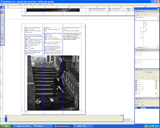
To begin with I added the document to the double pages altering its size so it fit. I then changed the questions into a different colour to make them stand out, and I did them blue so that it would match the colour scheme of my magazine.
I then decided on the image I was going to use and imported it onto the double page spread.
Next I added a quote on to the picture and edited my image in photoshop so that I could use a unique font for the headline. Furthermore I added a drop capital at the start of the article. This is my first draft.


After looking at my first draft I decided to make the image an entire page and get rid of the quote. The font of the headline was too similar to the font on the front cover, so I changed it to the font to impact to make it more basic. Furthermore I changed the drop capital to blue to make it look more interesting and made the line count 5 so it gives more of an impact. Due to making the image bigger I had to add an extra page to put the rest of the text on.

Next I added a black text box and put in a quote from one of the band members to break up the text slightly, so it entices the reader.

This is the additional page I had to create as my interview would not fit on one page. As there was a lot of white space after the article had ended, I had to import another picture that I took during a photo shoot to fill it up.

As I had developed a new colour scheme I needed the double page spread to follow this so I changed the headline of the article to red, the drop capital and also the quotation marks in the quote I selected. I also made the text box bigger so that I could fill the empty space on the third page. I also got rid of the white box behind the headline as I had changed the colour of the text to red so you could see it better against the photograph. Finally I added words and photos by on the first page.


As I had made the text box bigger on the second page, the gap had closed off. Furthermore I increased the size of the image.

Production - Screen Shots of my Contents Page

Roughly every 10 minutes I took screen shots of my contents page to show its production. 

First of all I added the title Contents to the page and wrote down all the regular and feature articles that would appear in the magazine. Next I constructed a picture box so I could insert an image.

I then chose an image that I wanted on my contents page and moved the feature column to the other side,as once I had finished adding all the articles both regular and features could not fit in the one column.


I felt that my contents page was lacking colour so I added a strip of blue at the top, and I changed the text colour to white so that it would be the same colour scheme as the front cover.

I then added a black text box to put behind the text regulars and features to make them stand out more. Next I imported another image and tried to find a layout that would fit them all on.

I imported my final image and found a suitable layout that would fit everything on. I moved the feature column so that I could fit all of my images on and have a subscription advert in the corner, whereby I have added a picture of my front cover. This is my first draft of my contents page.

After looking at my first draft I realised that the layout wasn't very effective so I put the regulars and features in contrasting columns again. I next moved my subscribe section from the bottom of the page to the top to fill up the space next to the word CONTENTS which gives the page a better overall look. Since I moved the subscribe section I had to create a box for me to import a final image.

To fit in with the colour scheme I changed the colour of the regulars and features boxes from black to red. As I had room for an additional image I imported another photograph of  Lydia Owen, who has a feature article within the magazine. Finally I also had to change the picture of the front cover in the subscribe section as I had made changes to it, such as the red and blue colour scheme.

I had to take an additional picture as it looked strange with two very similar images, so I invented a new band. Therefore I had to change one of the feature articles so that it would be cohesive to the image.

Monday, 10 January 2011

Production - Screen Shots of my Front Cover

Front cover

Roughly every 10 minutes I took screen shots of my front cover to show how I have created it.
Here I have just started to create my magazine front cover and added the title.

I added a barcode and added my positioning statement.

I wrote all of my coverlines on the cover, however I don't like it all being black.

Since I discovered from my questionnaire results that the target audiences favourite colour was blue I decided to change the text colour. I also wanted my title to stand out more so I made it bigger, changed the colour and added a white outer glow by going into layer then layer style. As the title covered part of the main image I copied the main image put it in front and used the rubber to reveal the title behind the image. Moreover, since the outer glow on the title was white I thought it would be more appropriate to use white text on the cover. I also moved the price of the magazine onto the top of the barcode as well as the web address because there was a bare space in the corner which I felt needed to be filled.

I continued to add more coverlines to fill some of the spaces, keeping to the new blue and white colour scheme.

Afterwards I decided that I needed an extra coverline on the right hand side as it was too bare.

After looking at my front cover I decided to change the artists name due to the fact that I had already used the word Indie several times within the coverlines. Next I moved the title down so that I coud fit the positioning statement above it. I made the barcode smaller (by doing ctrl t) after I realised that it would be too big once I printed it off. At the bottom of the magazine I added a strip listing bands and artists that would feature in the magazine by creating 2 separate shapes so I could fill them in, in different colours Furthermore I moved the price under the title of the magazine.


To make the main coverline stand out more I changed the colour of the rest of the other coverlines from blue to black. Moreover there was too much blue on the cover so this was another reason why I changed them to black. I also increased the size of the artist's name.

When the front cover was printed off I noticed that the blue was fairly dark and wasn't eye catching enough. Therefore I made the blue brighter by using the fill tool, and changed the name of the magazine to a bright red which stands out a lot more. I also made the main coverline slightly bigger by using ctrl t.

To make the main coverline stand out against the cover image I put an outer glow around the artists name and quotation marks.