Tuesday 19 October 2010

Audience Research - Questionnaire

For my AS media coursework I am designing a new music magazine. I would be grateful if you could take the time to fill this questionnaire out.
1.       Are you male or female? Please circle
Male                      Female
2.       Please state your favourite colour

3.       How old are you? Please circle
16        17       18       19      20      21       22       23      24
4.       How often do you buy a music magazine? Please circle
Weekly                      Fortnightly                      Monthly
5.       How much do you pay for a music magazine?

6.       Do you go to gigs or festivals? Please circle
Yes                             No
7.       Do you download music or buy CDs? Please circle
Download                           CDs                        Both
8.       Please state what you like about music magazines


9.       Please state what you dislike about music magazines

10.   Who is your favourite band or artist?

11.   On a scale of 1-5 where 1 is the most important and 5 the least, how do you rate the following aspects of a music magazine. Please circle
Pictures                          1        2        3        4        5
Competitions                  1        2        3        4        5
Band interviews              1        2        3        4        5
Music  Quiz                     1        2        3        4        5
Articles                            1        2        3        4        5
Gigs/concert info            1        2        3        4        5
Free gifts                         1        2        3        4        5
New music releases        1        2        3        4        5
12.   State 3 words that you would associate with indie music.


These were the questions I came up with for my questionnaire. I came up with a variety of questions which will help me to make decisions about the design, content such as interviews, price and the frequency of publication. Furthermore another reason for constructing a questionnaire is to make sure that my new magazine will appeal and be appropiate for the target audience, which is 16-24 year olds.

Friday 15 October 2010

Analysis of Double Page Spread Articles

The codes and conventions of magazine articles are:

  • One main image
  • Image generally has direct address
  • Sometimes the main image is the background for the article, with the text on top
  • One half of the article is the main image which sometimes bleeds between pages
  • The headline is usually only a few words long
  • Headline sometimes uses stylised fonts
  • Headline used to draw in the reader as it doesn't tell them what the article is about as it is done by the stand first
  • There is a drop capital at the start of the article to show you were to start reading
  • Quotes are sometimes used in the headline, on the picture or in the stand first or to break up the text
  • Stand first introduces the article and is positioned under the headline, this also often contains the journalists name
  • There is a simple/minimal colour scheme
  • Text is usually 11pt
  • Techniques to draw in the reader include: bold texts, slightly bigger type size, capitals for the first few words
  • Byline - who wrote the article and photographers credit
  • Laid out into 2-4 columns
  • Strapline at the top of the page tells you the subject matter e.g. interview
  • Article is usually written informally to appeal to the reader and therefore the personality of the journalist comes through

Tuesday 12 October 2010

Initial Plans for my Magazine

  • Price: £2.80
  • Frequency of Publication: Fortnightly
  • Average Issue Size: around 100 pages
  • Regular Content: top 50, new album releases, upcoming gigs, film, tv and radio reviews, letters, celebrity column
  • Feature Articles: interviews with bands or singers, band news/gossip, previous gig gossip, quiz, top 15 festival songs

Monday 11 October 2010

MAIN TASK

Researching the market place              

I looked on the two main magazine publishing websites; IPC Media and Bauer Publications to find and research music magazines.                    
      
I looked at Q magazine as this would be a competitor to my magazine. The price of Q magazine is £3.90. The frequency of the publication is monthly. The issue size of Q differs slightly on each issue but they all seem to be around 115-132 pages. Usual features include The Q50, were the magazine lists the top 50 essential tracks of the month; Cash for Questions, in which a famous celeb/band answers question sent in by readers - who win £25 if their question is printed; Ten Commandments, were a particular singer creates their very own ten commandments by which to live and Rewind, in which they take us back in time through the history of music via archive issues of Q. Its regulars consist of new music releases, reissues (music), music compilations, film and live concert reviews, as well as radio and television reviews. Q's publisher is Bauer.


Another magazine that would be a competitor to mine is NME. The price of NME is £2.30. The frequency of publication is weekly and is out every Wednesday. The issue size of NME is generally around 70 pages. The regulars in NME are generally pretty similar to Q magazine and other music magazines as they consist of: new music releases, film, live concert reviews and radio and television reviews. Feature articles consist of famous, widely known bands each week on their new single or album. The magazine also contains posters of these bands which acts as a puff to give the magazine something extra to help with it's selling point. NME's publisher is IPC media.
http://www.nme.com/


I also looked at the magazine UNCUT. The price of this magazine is £4.60. The frequency of publication for UNCUT is monthly, hence the price. UNCUT's issue size is generally around 149 pages. The feature articles that appear in UNCUT are: on old albums, interviews with film directors, music and film news, and reviews of all major new album, film and DVD releases. Its music features tend to focus on genres such as Americana, rock and alternative country. Regular content consists of: music releases and film information. UNCUT's publisher is IPC media.
http://www.uncut.co.uk/


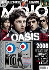
A further music magazine that I researched was MOJO. The price of MOJO is £4.30. The frequency of the publication is monthly. I could not find the issue size for MOJO magazine, however as it is a monthly magazine I can estimate that there will be a similar amount of pages as Q and UNCUT, around 140. Feature articles in the magazine inclue; band interviews which are also regulars as there are several intwerviews in each issue. Other feature articles inclue competitions. Mojo regularly includes a covermount CD which ties in with a current magazine article or them. There are frequent coverage of classic rock acts such as The Beatles and Bob Dylan, it has nevertheless featured many newer acts. MOJO's publisher is Bauer.

Sunday 10 October 2010

Evaluation of School Magazine

My media product follows some of the codes and conventions of a magazine, however they do not follow all of them. The masthead on my front cover is one word, 'BREAK' which is situated in the left hand corner and fills most of the width of the page. The price and issue date are by the masthead, however they are not the conventional 11pt size, they are similar at 12pt. My magazine does not contain a puff or buzz words because I was unsure how to fit them in with the contents of the magazine. Although in a way my magazine does offer something extra as the first issue is free and from my contents page it says that there are maps available near the back. My main coverline is the largest text on the front, other than the title which is conventional to magazines and it anchors the meaning of the one main image. Furthermore there is a subline below each of the coverlines to offer additional information about the article and also to intrigue the reader. The coverlines also frame the main image, however the main coverline runs across the girls face which is not conventional. Finally there there is a barcode in the bottom right hand corner and there is a small number of colours used for the simple colour scheme.
             My contents page is set out into four columns which lies across one page. The largest image on my contents page does not relate to the main feature article which in not conventional for the contents page. The name of the magazine is not at the top of my page however the word contents is. Another way that my contents page does not follow the codes and conventions is that the text is slightly bigger than the standard 11pt, I did this because I had no more stories left to fill up the page so I made my font size slightly larger. Under the name of each article I have given more detail about what the article is actually about, which is a smaller font than the article's title.
            In the construction of my magazine front cover I used the programme Photoshop. I had used this programme previous to the work, so it was quite easy to  make my front cover. To create the front page I only ever used the basic tools as they were all I required to complete my work. I created shapes using the rectangle tool and the ellipse tool. I did this to give my front cover a more visual appeal. Another tool I used was fill, which I used to fill in the shapes with the colours for my colour scheme. To construct my contents page I used the programme Quark Xpress. As I had never used this programme before, I found it quite difficult to use at first. When setting up the page I needed I set the column number from one to three so the layout would be conventional. Also I had to remember not to design the contents page on the master page. To import pictures I had to make what looked like a text box for the image and then right click, and import an image from my files. Once I got the hang of the programme it was quite simple and easy to use to construct my contents page.
            I feel that my strengths are using the programmes which I used to create my school magazine; photoshop and Quark Xpress. However I am more confident in using photoshop over Quark Xpress because I have used the programme prior to the coursework. However I do think that one of my weaknesses was the general layout of the contents page and front cover, as for example the text on the front cover ran over the girls face. So to improve on this for my music magazine I will design several layouts and choose the best one, so that no text covers the face on the main image. I would also improve the images that I will use by taking several of the same thing instead of one so there is a selection to choose from. On the other hand I thought that the articles that I had to come up with to fill my magazine were done quite well as well as my coverlines.

Saturday 9 October 2010

Production of School Magazine Contents Page

In the following lesson we had to create our contents page for the school magazine. We used the programme Quark Xpress to do this. I also took screen grabs every ten minutes to show the development of my work.

One of the only things that I changed in the process of creating my contents page from my rough sketch, was that I left out the small image of the front cover of my magazine in the top right hand corner. I did this because I made another image bigger so there was no room for it to go anywhere.


 The only other thing that I changed from my rough sketch is that I made the 'Ice Factor' picture twice the size as I thought it would look better.


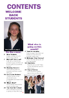
This is my finished contents page for the school magazine.


Production of School Magazine Front Cover

We were given one lesson to complete our magazine front cover on Photoshop, following our rough sketch. Whilst creating the front cover I took screen grabs every ten minutes to show the production of it.

 One of the only things I changed from my rough sketch was the shape that surrounds the text "1st Issue FREE!". This is because it was a more realistic shape to create rather than a rosette which is a more complex shape to create on photoshop and in the allocated time we had.


 This is the final cover of my school magazine. This is slightly different to my rough sketch due to the change of shape from rosette to circle, and that I added a barcode in the bottom right hand corner.

Sunday 3 October 2010

Preliminary Exercise

Draft for front cover and contents page:

In the lesson I had to come up with a rough sketch of my school magazine cover and contents page. Here is the sketch of my front cover:

The articles inclue:
  • New uniform
  • Worried? Stressed?
  • Roaring Success
  • Ice Factor
  • Whats New?
  • Too Cool for School


Here is the rough sketch of my contents page:

The images I am going to use on my contents page are:

  • The main image from the front cover of the student in uniform
  • Somone singing for the Ice Factor
  • A group of students in non uniform
  • A group of sixth form students cheering

Preliminary Exercise

Plans for front cover:

Title - BREAK
Coverlines - New uniform, Ice Factor, exam results, sixth form students, problem page and whats new
Mise-en-scene - main image of a student wearing the new uniform (medium close up) and a smaller image of a group of students cheering

Shot Types

Codes and Conventions of a Music Magazine Contents Page

In the same lesson we also had to identify the codes and conventions of a music magazines contents page and this is what I came up with:

  • Layout - set out into columns, usually 3 or 4
  • One main image - relating to a feature article
  • - Other smaller images
  • - Structured layout
  • - Page numbers on the images which anchors to the written contents
  • Top of the page - name of magazine, issue date and the word contents
  • Subscription and contact information
  • Editors letter - sometimes appears on the top,left hand side of the page
  • Contents - is divided into categories and headings used to identify each category
  • An image of the front cover of the magazine
  • Colours - contents page uses the same, simple colour scheme as the front cover
  • Contents - written in the same conventional way: first line - page number, 1 or 2 words which could be the artists name or ambiguous text to intrigue the reader in bold type and often capitals, (12 or 13pt) subline(s) - gives more specific detail about what the articles about, smaller font and Roman, largest type size is 11pt.
  • Photography - is credited for the front cover, and there are interesting and varied photographs
  • Main categories - features and regulars
  • Bottom - page number, magazine title, issue date, often web address
  • Usually 1 or 2 pages

Codes and Conventions of a Music Magazine Front Cover

In the lesson we were given a selection of music magazines covers and our task was to identify the codes and conventions of the front covers of these magazines. These are the list of conventions i came up with:


  • One main image which takes up the whole cover
  • - Usually the main feature article
  • - Studio photographs which conveys the band/singers attitude
  • - Direct address
  • Title (masthead) - has a trademark, unique font
  • - Usually one word
  • - Fills the width of the cover, or is in top left corner
  • - Positioning statement - usually above or below the title
  • - Price and issue date by the title (11pt size)
  • - Sometimes by the barcode
  • Puff - offers something else to the magazine
  • Buzz words - usually with main feature article e.g. "EXCLUSIVE"
  • Cover lines - lines of text on the front cover. Main coverline is the largest text on the cover after the title and it anchors the meaning of the image. Usually a subline in smaller text giving more information about the article. Other coverlines are usually one or two words with sublines explaining them.Some are used to intrigue the reader.
  • Barcode
  • Strip across the top or bottom containing lists of artists names who feature in the magazine
  • Coverlines - frame the image or are down one side of the magazine
  • Colour - small amount used with a simple colour scheme

Saturday 2 October 2010

Introduction

I am a year 12 student who has decided to choose media as one of my A-levels. In class we were given a brief of what our coursework consisted of. First we have to do the preliminary exercise whereby we must use desktop publisher and an image manipulation programme such as photo shop, to produce the front page of a new school magazine, featuring a photograph of a student in a medium close-up, plus some appropriately laid-out text and masthead. Furthermore we must produce a mock-up of the layout of the contents page to demonstrate our grasp of desktop publisher. For the main task we have to produce a music magazine cover, contents page and a double page spread of the new magazine. Finally all of the text and images we use must be original and produced by us.